websites

Good Website Navigation
"Creating good web site navigation is the most important task a web designer has to accomplish in the web design process." (http://www.mardiros.net/good-navigation.html)
Good navigation will help people navigate through pages within the Web Site as well as outside of the Web Site without complications. Nobody wants a difficult Web Site to use because it does not help the user. They will loose interest and leave the Web Site, so it must be easy to use and constructive, also consistent is important. An Internet user could be able to come across with a good Web Site, however, the navigation is poorly. A viewer should not be able to come on to a Web Site and look around to see where the navigation menu is located. I feel that it should only take a few seconds locate the navigation menu. If you can not find the navigation menu in a few seconds, then there is a problem. The reason people come to a Web Site is to get information. If the viewer has a hard time navigating, perhaps its difficult to find what they are looking for, will loose interest and eventually leave the Web Site. Some people use images as part of their navigation menu, but be sure to use it in the other pages and at the same location so the viewer knows where to look on the following page. For bigger companies, may use scroll down menus or bread crumb trails, but my site will use the basic navigation menu. Links are important too so that they are accurate and accessible to that page.
There are so many ways to make a Web Site interesting. However, a Web Designer should never copy another Web Designer's site. "It is often a tough challenge to come up with a meaningful, unambiguous way to organize, arrange, and display content to users; and it's often not much easier to find a visually interesting solution either." (http://www.smashingmagazine.com/2011/04/19/showcas... I feel that a Web Designer should be more creative with their own design, and that also means for the designer to sketch out their pages and thinking things through before designing, also making sure that the Web Site has good grammar. This also helps build credibility for them. Some Web Designer may have extra links to their site where the viewer could go onto another Web Site to help them. There is also a place where a viewer would have to sign in so they could retrieve full access to the Web Site, and if it is a blog that the viewer may be interested in, they could simply register to follow that Web Site.
One of my good examples of good navigation Web Site is that I want to make sure that my navigation menu are at the top of the Web Site right below the site's logo. Sometimes when I view other Web Sites, I do notice the navigation menu would be on the left side.
"Traditionally the navigation menu is placed just below the header area or on the left hand side of the web page. Usability studies have shown that web site visitors instinctively look in these areas first." (http://www.jrox.com/content/article/139/good-websi... In my Web Site "The Life In Northern Ireland", my navigation menu will be below the header. This way when viewers go onto my site, they know where to go and able to navigate it quickly and easily.
I will be adding pictures to my Web Site. I always thought pictures makes a Web Site more interesting as well as presentable so it keeps the viewer on the Web Site. My reason for add pictures is to give the viewers an idea how beautiful Northern Ireland is and worth visiting.
I want to try to make the Web Site as convenient to the viewer without complications. I know that it could be a hassle with many clicks with the mouse and not reaching anywhere. This could be frustrating so the lesser clicks on my Web Site the better for the viewer to stay on my site. Another good thing I may be considering is helpful and related links so it will help the user to find other resources. I am also adding a contact information in case viewers would need to contact me and want to know any additional information on the Web Site.
Website Analysis for Etsy.com
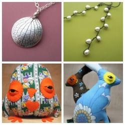
Etsy.com is an online market place that is filled with artists, designers, and crafters. Etsy has become a good place for these artists, designers, and crafters to place their hardwork on there and try to sell their items. There are some positive views, which I am sure that there are also negative views about the web site. Some people are not familiar and never heard of Etsy.com. It’s a web site where people of all ages who could be able post their items on to the site and try to earn some pocket money. Etsy members could also give the option of purchasing from other sellers. Even if you are not a member to Etsy, you could still be able to purchase from sellers. Those buyers are given the option how to pay for whether it would be Paypal, check, or credit card.
Etsy.com is good for me because as a crocheter, I am able to make some stuff and create a store on there and try to sell them from the site. When I first created an account, the most important thing for me was to be able to post the photos of my work and a description about each one. As far as navigating the web site, it did not take that long until I was able to navigate the web site quickly. I do look at other crocheting items to get an idea of what else to make. I like the fact that the web site has reasonable prices because this day of age, things are very expensive so when viewers purchases that item on Etsy, they are saving a lot of money for themselves compare to that item at a regular store.
The rules of Etsy.com are that it tells you what you can sell if it is either handmade goods, vintage items, or supplies. In my opinion, Etsy.com is pretty much easy web site to navigate. The topics are located on the left side of the website as topics. When youc click onto the topics, sub-topics are shown. The topics are in alphabetical order so that the user could be able find the topic quickly. The user is also given the option to do a quick search for a particular item in the search bar. When they use this option, items will be displayed from all sellers. If the item doesn’t display below then there aren’t any items that was made by any stores.
Etsy.com has interesting links that could be of use to the viewer’s such as a community section. The community section will display any events that are appearing in your area or other areas. There are also blogs to keep everyone updated what is happening. I had tested all the links on Etsy.com making sure that they are all in working order. If some links are not in working order, it would not make a good web site, and visitors may lose interest in the website. All the links on Etsy.com are in working order. However, there is not a home link page to bring to the main page. I had to keep pressing the back space button from the previous pages. But, I then realized that when I had pressed the Etsy word (next to the register and sign in button) on the top left, it turned out to be a link, and that had brought me to the main page. I would never had known about that until I pressed it, so I feel there should be a home link page so that other viewers could be able to know where to navigate back to the home page.
When each item is posted, the user has to be very specific in order to make a good presentation for each item in order to sell it. When there is a problem, the user can easily use the “Help” button located at the top right hand corner. I like this site very much because if I run out of ideas, especially around the holidays, I could be able to go to this web site and see what I could find. I had found some knick knacks last Christmas.
I like this web site because it gives me the opportunity for exposure and try to sell my crocheting items. If it wasn't for www.ravelry.com, I wouldn't have discovered Etsy.com because someone on ravelry introduced me to the site. What I enjoy about this site is that there are so many unusual stuff and that makes the site interesting, which makes me want to return to the site.